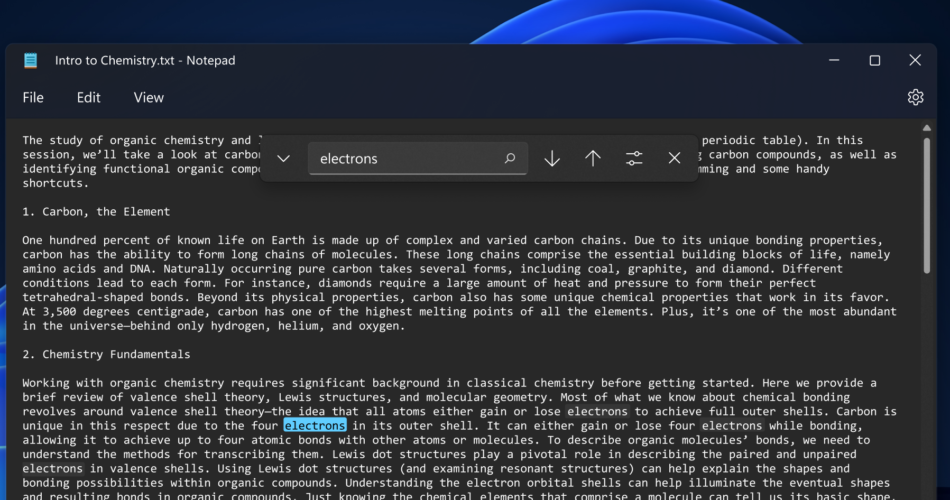
Microsoft is testing a redesign of its venerable Notepad app, adding some welcomed modern features like a dark mode, a better search / find and replace interface, better undoing, and more.
While the visual updates like the addition of dark mode, updated right-click menu, and Windows’ new theme-adopting material are nice, the functional updates will probably be the biggest upgrade to anyone who actually writes in Notepad. In the current version of the app that ships with Windows 11, the text search tool and the find and replace tool are two different pop-up windows, accessed by two different keyboard shortcuts. The redesign combines them into one floating bar instead of something that looks like it’s from the XP era.

Microsoft also says it’s adding multi-step undo, which replaces the old version’s undo system that only lets you go back one step. It still doesn’t work like you might expect a modern app to, letting you hit Ctrl-Z to delete one word at a time, but it clearly has more memory than the old version of Notepad.
he Notepad redesign should be available for Windows 11 Insiders using the Dev channel. If you’re running the test version of the OS and don’t see it, you may want to check for an update in the Microsoft Store. Everyone else will likely have to wait a little bit to get it, but it’s nice to see Microsoft continue the trend of updating some of its built-in apps like Notepad, Photos, and Paint alongside its bigger products like Office and, of course, Windows.

